Safer - A Concept
Role: Ux Researcher + Designer
Research | Interviews | Ideation | Mid-fidelity Prototype | Prototype Presentation
Research & Interviews
In the fall of 2018 I was invited to the HBCU Making and Innovation showcase with the AAAS as a part of a startup team of 4. Teams were asked to choose between a list of challenges to focus on. We chose the UN Sustainable Development goal of gender equality, specifically focusing on sexual harassment and rape culture. Before creating a concept we decide to consult with Spelman students. At the time the sample was convenient and relevant, since the all-women’s college was reacting to the #MeToo movement and student protests regarding campus safety, sexual harassment and gender-based violence. We interviewed 4 students and were able to identify two major problems we felt we could provide a solution for:
For people that experienced harassment, feeling alone in situations that were dangerous or uncomfortable or being unable to identify anyone willing to help
For people who witnessed it, feeling as if it wasn’t their place to intervene or being unsure about if help was needed
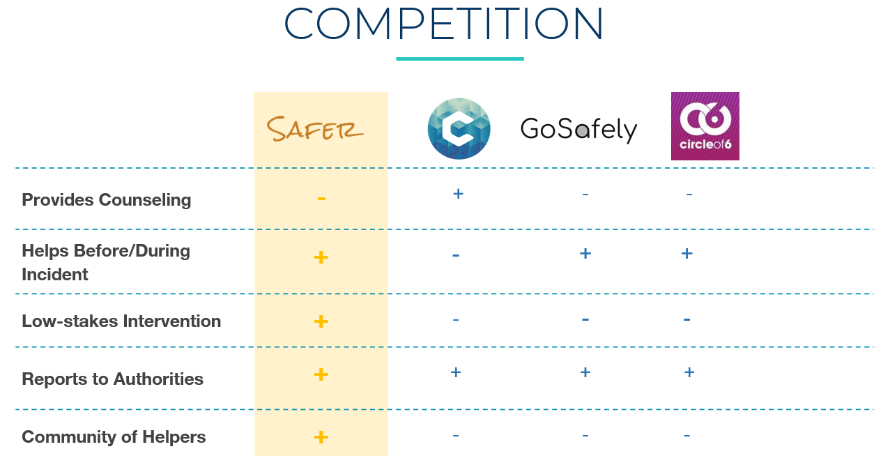
We decided to tackle these issues by designing an app for people who want a support system as a safeguard against harassment and uncomfortable interactions. We started by taking a look at apps and technology based solutions with similar goals. It turned out there were several tools, devices and apps designed to help combat gender-based violence. Three of them came particularly close to our initial concept. I worked with my team on a comparative analysis of their features, analyzing what they provided and comparing them to what we planned to offer.
IDEATION
The app’s concept centered around the idea of low-stakes intervention. It was designed to help encourage a culture where people are more comfortable asking for and providing help in situations where people feel most alone. Similar to other SOS features and applications, Safer’s goal would be to allow users to contact someone nearby immediately. Safer users would have access to a network of helpers who have agreed to keep each other safe by fulfilling low-stakes interventions like calling their phone to interrupt a conversation. Unlike an SOS, Safer was designed to be a low-stakes intervention with preferences for the type of help set by the user. We hoped to counteract the bystander effect, when people fail to help others in need when they are around others, by offering our users a way to discreetly signal their need for help and provide their helpers with a direct request and simple instructions for how to help. To demonstrate how it would be used and in what contexts, I storyboarded the steps of downloading the app, going out, and using the phone to ping others for help during an unwanted encounter.
Prototyping & Presentation
I worked as the team’s UX designer and focused on conducting product comparisons and interviewing potential users during the concept formation stage. I was able to take what we learned and use it for storyboarding, app illustrations and working with the team to stitch together a mid-fi prototype using Sketch and InVision. At the AAAS showcase we presented the two prototypes simulating the scenarios of those requesting help from others in their Safer network and of those receiving alerts about the requests.
Insights and Takeaways
During the demonstration we got useful suggestions and feedback on our prototypes. My key takeaways were this:
A prototype goes a long way - When we were first creating concepts our team received encouraging feedback, but it was hard to determine concerns and insights. With our mid-fi prototype we were able to hear concerns about vetting Safer helpers, and take questions about potential features like customized discreet screens.
Find the right partners - Our team did most of the research and conception of the ideas on our own, but it would have been helpful to partner with student groups that also focused on community-building and activism.
Enjoy the time it takes - Our initial concept was ambitious, and we had to be willing to put in hours on weekends and after classes to learn how to use prototyping tools, critique and rework our own ideas and bring together a pitch for our product. Enjoying the process and our work together made it feel less like work.


